
EduPay payment gateway
Harry Saunders
January 23, 2013
During my employment with Open Colleges, one of my major projects was to redesign the online enrolment portal. A large proportion of visitors to the Open Colleges website are viewing it on their mobile device so whilst performing well, there was a definite need to revisit the UX and visual design. The site is responsive and targets Mobile, Tablet, Laptop and Desktop size devices. The result hugely improves the user experience.
An example of EduPay can be found here (If you are viewing on a desktop and would like to see the mobile view, reduce the size of your browser).
Responsibilites:
- IA & Wire frame, UX Design & Graphic Design
- Cross-browser & OS testing
Technologies Used:
- Pen & Paper, Sticky Notes, Photoshop
The Project
Being the web designer embedded within the marketing team, I was constantly looking for ways to optimise and improve the experience for the most important part of the business; the client. Through use of Google Analytics, Visual Website Optimizer and customer feedback and after meeting with the leadership team to advise, I championed the move to improve the user experience of the in-house developed online payment gateway, EduPay.
We already knew, through Google Analytics and other metrics that there was a 90% abandonment rate from potential customers clicking the “Enrol Now” button, on the various marketing landing pages and course pages, to actually completing the form. The reason for this high abandonment rate was the user interface was quite overwhelming.
I also wanted to future proof the build as the trend for mobile use was growing, though at the time only 10% of users viewed the website on their mobile device.
The Solution
By creating a brief project outline, I could confirm the goals, creative rationale, issues to be addressed and the solution to the main Stakeholders (in this case the Joint Managing Directors, Sales Director and Marketing Director).
Goals:
- Optimise EduPay to be a positive experience for all users, mobile first
- Simplify the path to enrolment
Creative rationale:
- EduPay is now around 2 years old*, and though performing well requires a freshen up
- OCA 3 is going to be responsive which mean users will be able to enrol from mobile. Current EduPay isn’t a good experience for mobile users
Issues to be address:
- Current forms too long for mobile
- Validation not optimised for mobile and could be better for desktop
How do we improve the user experience?
- Break all action areas into modules (Bite sized chunks)
- Make the instructions more conversational to explain the steps
- Inline validation. Will tell the user if an error has been made straight away, or take them directly to the first error again.
- We don’t want one of the first experiences with Open Colleges to be a hindrance in any way.
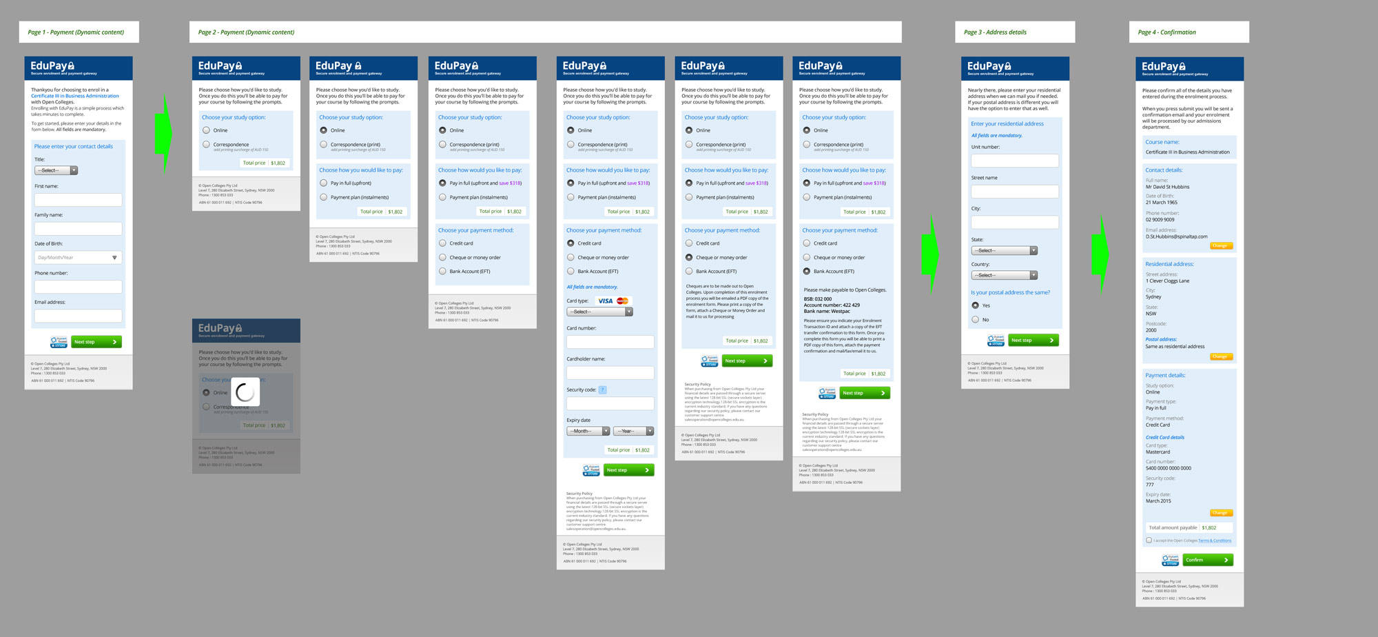
- Make the experience a more standardised ecommerce path.
- Sign up / Enter contact details
- Payment
- Delivery details / Residential address
- Confirm and submit
*as of September 2012
From this point, I started to create wireframes on paper and mockups in Photoshop, which I then presented to the Exec team for sign-off which you can see below.
The Presentation
An example of EduPay can be found here (If you are viewing on a desktop and would like to see the mobile view, reduce the size of your browser).