Open Colleges
Harry Saunders
July 20, 2011
After Cengage Education was acquired in 2010 to become Open Colleges, I was asked to “reskin” the older (direct marketing focussed) website I’d designed with the new branding. The previous website had been designed to make it as easy to get just enough information that the user would be encouraged to fill in a form for a course brouchure before being called by a member of the sales team. The websitesite worked really well in generating leads but the conversion rate wasn’t ideal.
Responsibilites:
- IA & Wire frame, UX Design & Graphic Design
- Front-end development
Technologies Used:
- Photoshop, HTML, CSS, JQuery
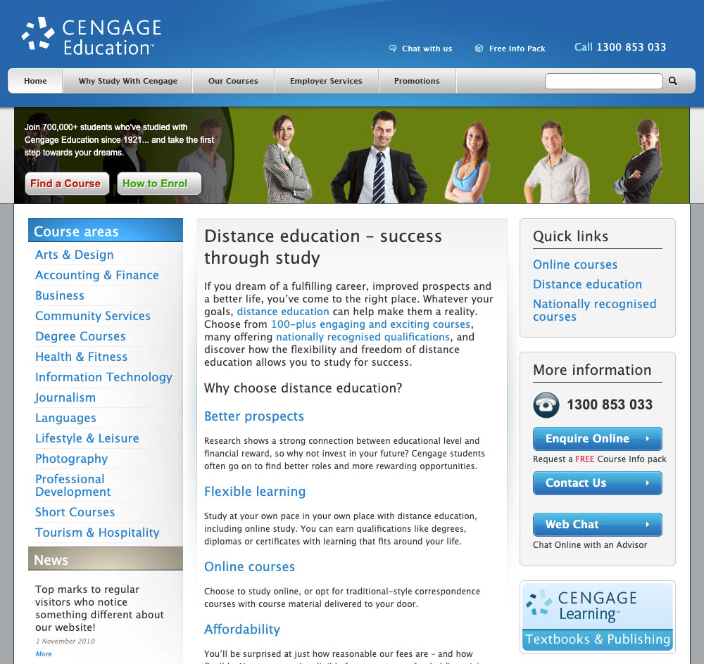
The following two images are examples of the Cengage Education website. As you can see, it is very direct marketing focussed with the goal of generating leads.
The Project
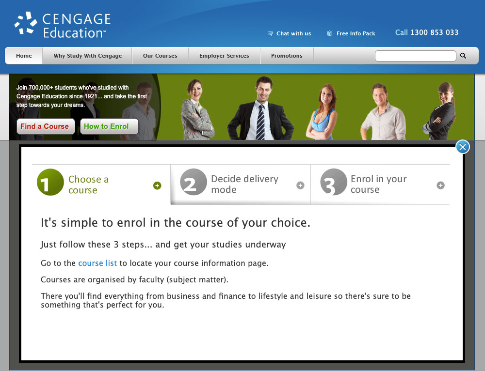
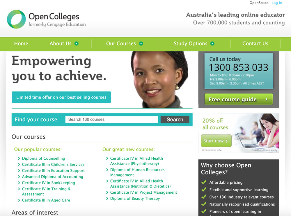
Fast forward to 2011, the Open Colleges leadership team decided to target a different demographic. The idea was to attract an “educated lead” and try improve the conversion to sales rate. Call to action (CTA) areas were made less prominent and pages had more information. This had an adverse effect as users didn’t require a downloaded brochure and the number of leads coming in was greatly reduced which in turn made the sale team’s job a lot more difficult. Another consideration was that Open Colleges wasn’t well known enough to be trusted as a quality education provider. In the example below, you can see there is no clear call to action.
The Solution
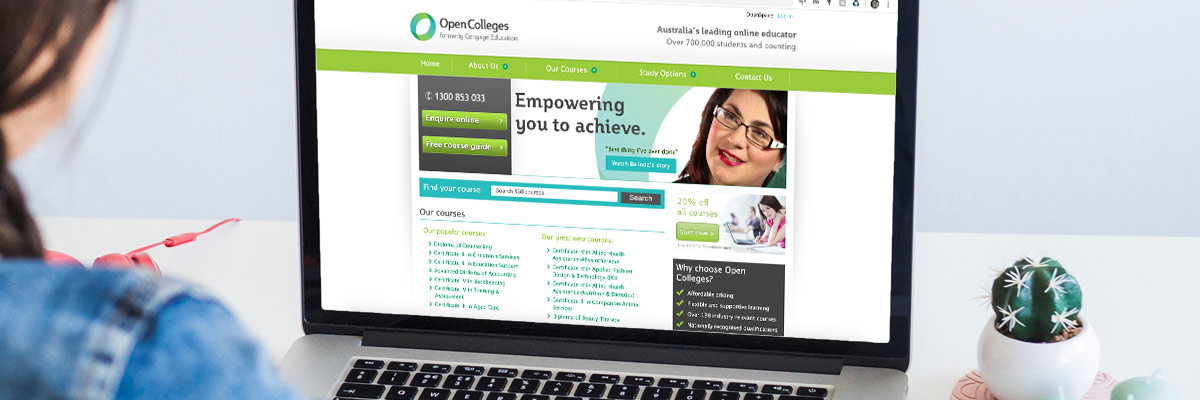
After some user analysis experiments using Crazy Egg Heat Maps and Visual Website Optimizer (VWO), I suggested a simple solution. By adding a prominent CTA in the header area we saw 80% increase in leads. We also gave the website a sense of scale by stating the number of students that had enrolled in a course, we added proof points and a search bar so users could filter by keyword.
We tried different placements of the CTA area using VWO and found that having it on the right side of the hero area was the best.
The next stage in the evolution of the website was to make it responsive, which was my recommendation but I left the company before that project started.